About calligraphy paper: pointed pen slant guides and lettering ratios
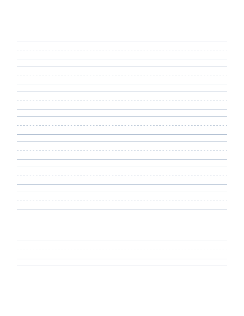
Calligraphy paper provides specialized ruling with horizontal ascender, waistline, baseline, and descender guides paired with angled slant lines. It is designed for practicing pointed pen script, Copperplate, Spencerian, modern calligraphy, and brush lettering with precise stroke discipline.
By establishing exact proportional ratios and consistent slant angles across every row, these practice sheets train hand coordination and muscle memory, allowing letterforms, flourishes, and connections to develop balance and harmony.
Achieving consistent letter height and uniform slant is one of the most demanding disciplines in penmanship. Printable calligraphy guidelines provide a reliable geometric scaffold that removes visual ambiguity, freeing the writer to focus entirely on pen angle, nib pressure, and fluid ink flow.
This page starts with Letter paper (215.9 × 279.4mm), 15mm page margins, and portrait orientation. The editor above shows your current configuration.
Understanding the four guideline boundaries in calligraphy
Traditional calligraphy and formal hand lettering rely on four horizontal reference lines to govern letter proportions: the headline, waistline, baseline, and descender line. The core body of lowercase letters such as a, c, e, and o sits between the waistline and the baseline, a region referred to as the x-height.
Ascenders from letters like b, d, h, and k extend upward from the waistline to the headline, while descenders from letters such as g, j, p, and y extend downward from the baseline to the descender line. Maintaining consistent height relationships between these four levels is the foundation of uniform, elegant script across entire manuscripts and greeting compositions.
Slant guide lines and pointed pen script angles
Slant guidelines provide an angled visual benchmark across the entire page, helping the calligrapher maintain a uniform letter slope. In English Roundhand and Copperplate script, standard slant angles typically range from fifty-two to fifty-five degrees relative to the horizontal baseline. Spencerian script frequently employs a slightly steeper fifty-two degree slant.
For italic and foundational hands, a much gentler slant of five to ten degrees from vertical is standard. The generator allows you to set the slant angle in degrees, generating crisp angled guidelines across the sheet. Beginners benefit greatly from fifty-five degree slant lines spaced across the row, as human vision naturally tends to over-straighten or over-slant letter strokes as fatigue sets in during longer practice drills.
Configuring x-height, ascender ratios, and line spacing
Different calligraphy styles require different proportional ratios between the x-height and the ascender or descender lengths. Classical Copperplate often uses a three-to-two-to-three or two-to-one-to-two ratio, while modern brush calligraphy may feature compact ascenders with exaggerated descenders.
The editor allows you to adjust the total writing band height and the blank gap between successive writing bands. An ample gap between rows ensures that descending flourishes from the upper line do not collide with ascending loops on the line below, preserving clarity across complete practice texts and compositions.
Pointed pen, broad edge, and brush lettering practice
Whether you are practicing with flexible pointed metal nibs, broad-edge dip pens, fountain pens, or flexible brush markers, guideline sheets eliminate guesswork and train muscle memory. The subtle guidelines provide clear structure while remaining light enough to allow finished ink flourishes to stand out prominently.
Regular practice on structured guidelines develops consistent stroke width, entry angles, and oval shapes. Using high-quality fountain pen or calligraphy ink ensures clean lines without feathering or bleed-through, enabling both sides of the sheet to be used effectively for lettering studies and draft compositions.
Paper selection and test printing for calligraphers
Dip pen nibs and liquid calligraphy inks require paper that resists ink bleeding and feathering. For optimal practice, print your custom guideline sheets on smooth, heavy paper stock, such as thirty-two-pound laser paper or specialized marker paper.
Ensure that your printer settings are set to one hundred percent scale so that the physical millimetre ruling and slant degree angles remain exact. Inspect the line color and weight in the preview; a soft, muted tone ensures the guidelines guide your pen without distracting from the beauty of your handwritten script.
Download and print without changing the measurements
Use PDF for a clean printable file with vector lines and the selected physical page size. Match the loaded paper to the document, choose Actual Size or 100%, and disable automatic fit or shrinking. The on-screen preview is scaled, so it is not a physical ruler. Print one test sheet before preparing multiple copies, and measure the optional 50mm check marker if you need to check scaling.
SVG provides one editable vector sheet, while PNG supplies a single raster image at a documented 150 DPI. Other apps may assign an imported image a different physical size. For predictable printing, prefer the PDF and follow the printing guide. The file can preserve measurements, but the site cannot change printer-driver settings or verify a physical print.
Keep a useful configuration for next time
Save a named configuration in My papers when you want to reuse it. Storage is local to this browser and device, so export a JSON backup if the layout matters. You can also combine saved snapshots in a paper pack.