About character grid paper: Tianzige, Mizige, and Genko Yoshi sheets
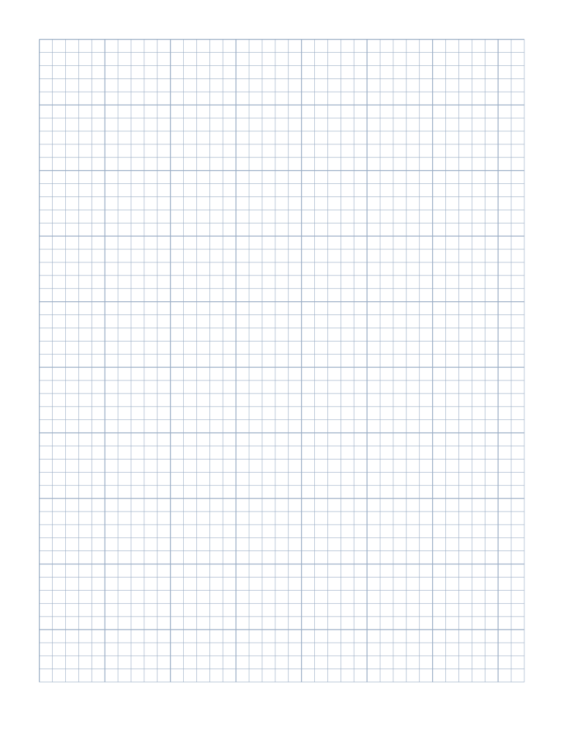
Character grid paper provides regular square cells with interior cross and diagonal guidelines, designed for practicing Chinese Hanzi, Japanese Kanji, Hiragana, Katakana, and Korean Hangul. It establishes clear geometric boundaries for balanced stroke proportion, radical placement, and spatial discipline.
Whether used as Tianzige for elementary Chinese character practice or Genko Yoshi for Japanese essay writing, these structured grids help language learners master character balance, stroke order, and centered alignment across every row.
Unlike Western ruled notebooks where words flow horizontally across an open line, Asian logographic and syllabic writing systems require individual characters to fit neatly within an imaginary square bounding box. Consistent practice inside dedicated character frames ensures that characters do not drift, tilt, or expand unevenly across the page.
This page starts with Letter paper (215.9 × 279.4mm), 15mm page margins, and portrait orientation. The editor above shows your current configuration.
Understanding Asian character square grids and structure
Asian character writing systems, including Japanese Kanji, Hiragana, Katakana, and Chinese Hanzi, require balanced proportion within a square bounding box. Each character must occupy a centered, harmonious space with balanced stroke weights, radicals, and clearances around the outer perimeter.
Character grid paper organizes the page into neat square cells that prevent strokes from wandering or crowding neighboring characters. The generator lets you set the exact millimetre size of each character square, as well as customize total rows and columns to fit your practice goals. Elementary students frequently begin with larger fourteen to eighteen millimetre squares before progressing to compact eight to ten millimetre boxes for advanced composition.
Tianzige cross grids versus Mizige star guides
Tianzige grids divide each character box into four equal quadrants using subtle horizontal and vertical dashed midlines, resembling the Chinese character for field (Tian). This cross division assists students in identifying the center of gravity, vertical stroke alignment, and horizontal stroke symmetry.
Mizige star grids add diagonal division lines through the center, resembling the character for rice (Mi), providing additional reference points for slanted falling strokes such as pie and na. The internal dashed lines can be toggled on or off in the settings to accommodate beginners learning stroke geometry or advanced writers practicing fluid manuscript composition.
Genko Yoshi manuscript paper format and vertical writing
Genko Yoshi is the traditional Japanese manuscript paper format used for school essays, literary drafts, and exam compositions. Traditional Genko Yoshi sheets arrange squares in vertical columns that read from top to bottom and right to left, often featuring punctuation margins and word count boundaries.
Whether you write vertically in traditional format or horizontally in modern classroom notebook layout, structured square boxes maintain consistent spacing between words and punctuation marks. Adjusting row and column counts allows you to configure sheets matching standard two-hundred or four-hundred character essay formats.
Stroke order discipline and radical balance
Mastering character writing requires deliberate stroke order (Bishun) and radical balance. In compound characters containing left-right or top-bottom components, the interior quadrant guides help writers allocate proper spatial proportions, such as one-third width for a radical and two-thirds width for the phonetic element.
Repeated practice on structured square sheets trains visual proportion recognition, ensuring that complex multi-stroke characters such as those with fifteen or twenty strokes fit cleanly within the same visual boundary as simple single-stroke characters.
Pencil, gel pen, and brush practice printing tips
Print your character grid paper with crisp, fine lines so that guideline borders remain distinct without bleeding into black ink or pencil strokes. Always select Actual Size or one hundred percent scale in your printer settings to maintain exact physical box dimensions across every row.
Smooth white paper works wonderfully for pencil and fine gel pens commonly used in language homework, while heavier paper stock prevents feathering when practicing with traditional brush pens (Fudepen) or calligraphy dip ink. Test a single page before printing class packets.
Elementary English handwriting paperPrint accurately at actual size
Download and print without changing the measurements
Use PDF for a clean printable file with vector lines and the selected physical page size. Match the loaded paper to the document, choose Actual Size or 100%, and disable automatic fit or shrinking. The on-screen preview is scaled, so it is not a physical ruler. Print one test sheet before preparing multiple copies, and measure the optional 50mm check marker if you need to check scaling.
SVG provides one editable vector sheet, while PNG supplies a single raster image at a documented 150 DPI. Other apps may assign an imported image a different physical size. For predictable printing, prefer the PDF and follow the printing guide. The file can preserve measurements, but the site cannot change printer-driver settings or verify a physical print.
Keep a useful configuration for next time
Save a named configuration in My papers when you want to reuse it. Storage is local to this browser and device, so export a JSON backup if the layout matters. You can also combine saved snapshots in a paper pack.